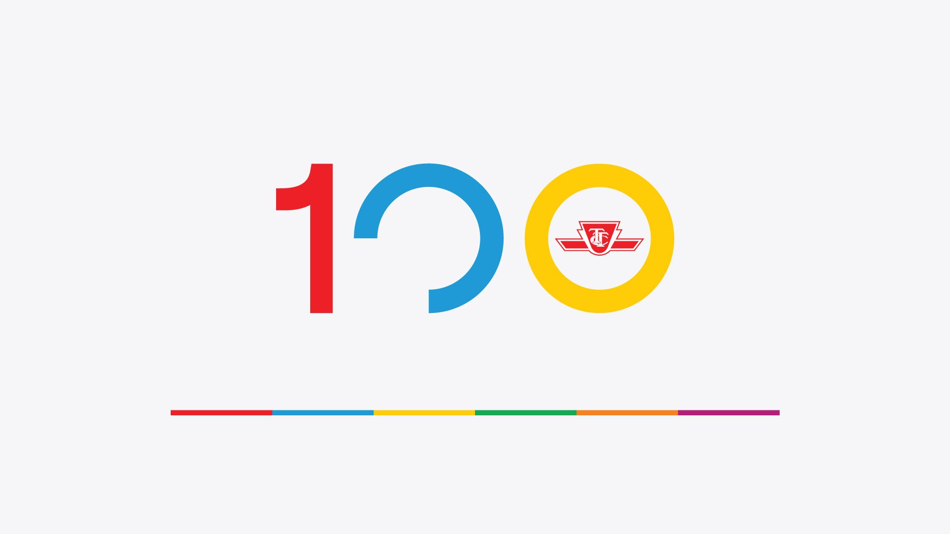


I love dynamic logos for their versatile and playful appeal. Designing for TTC's 100th anniversary, I envisioned motion even in the static version.
-
Create a versatile 100th-anniversary logo for TTC that suits various mediums, including large-scale print, digital, social media, and merchandise like clothing, lapel pins, and mugs. The logo should also be suitable for animation.
-
I aimed to create a brand identity emphasizing TTC’s diverse transit modes. I wanted it to showcase the 100-year legacy without a vintage touch opting for a modern, clean design that symbolizes the future more than the past.
-
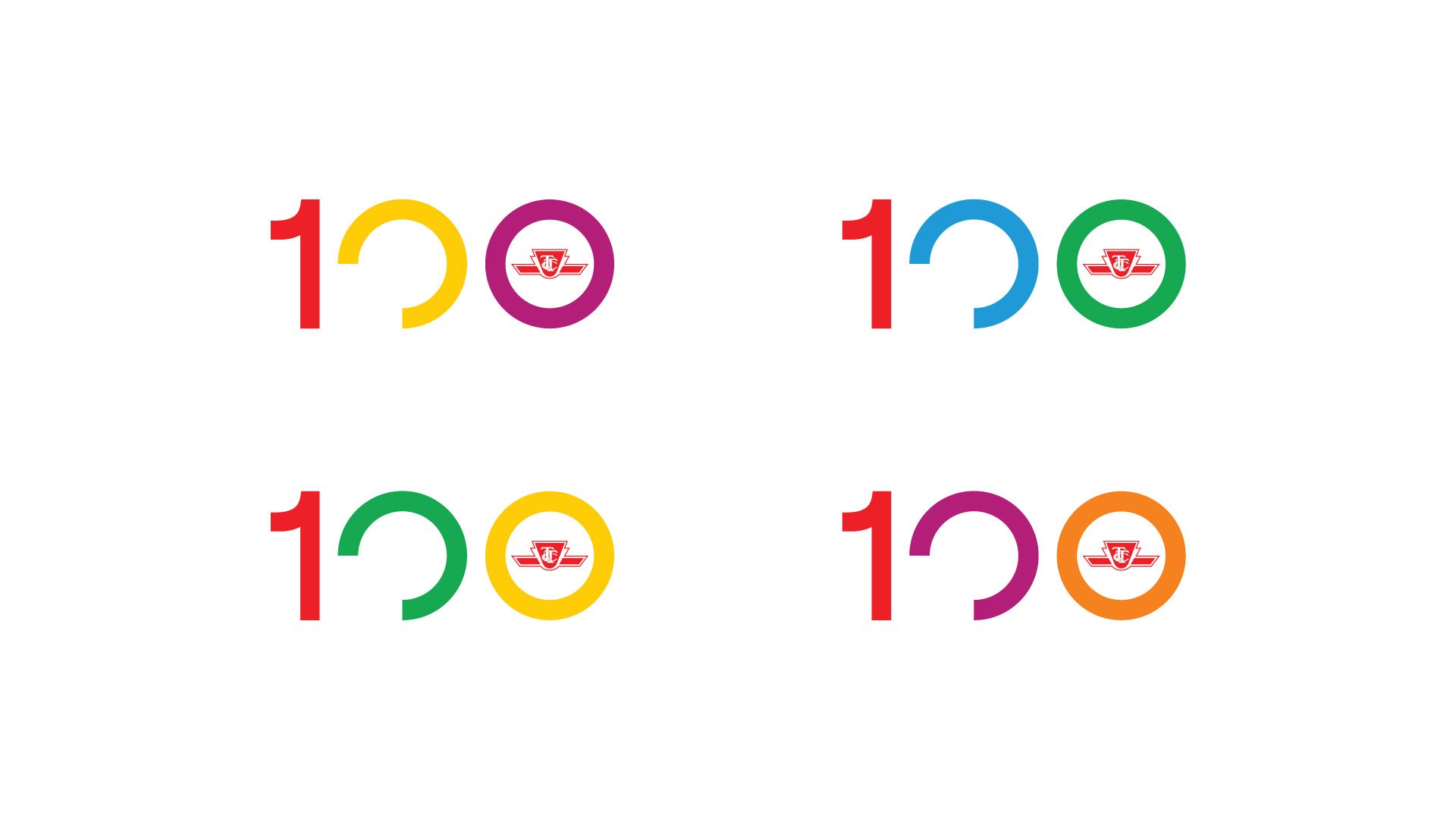
I love dynamic logos for their versatile and playful appeal. Designing for TTC's 100th, I envisioned motion even in the static version. I wanted you to be able to feel the movement in the creative, so that even when it’s still you can sense the bustle of the city in the lines of the logo. Although I initially aimed for a dynamic design — the structure of the logo moving and changing along with the colours — the client preferred a single design with colour alternates for simplicity, still embodying the vibrant transit spectrum.
-
I aimed to convey Toronto's fast-paced energy in the animation with lines rushing into the 100 logotype and used TTC’s six transit line colours to illustrate that energy. While the envisioned soundtrack featuring city sounds didn't fully materialize, I imagine the animation accompanied by bus horns, subway rushes, and the clatter of streetcars on rails.
-
My biggest hurdle was in getting caught up in how things had been done at TTC previously. I wanted the branding of this campaign to feel like TTC, so I went through a lot of their previous completed projects to try and get an understanding of the evolution of work to this point. This hindered my process as I would get a past or failed concept stuck in my head and found myself trying to improve on it instead of creating something new.
To break free of this loop, I drew inspiration from unconventional sources like cartoon animation. I stripping concepts to their simplest design. This approach helped shift from predetermined ideas to exploring new possibilities for the campaign's look. -
I have a deep appreciation for every aspect of this piece, from its creative process to the final selection. Having my concept chosen to represent this pivotal moment in TTC's history was incredibly thrilling. Selecting a favourite detail is tough, but if I had to, it would be how the colours representing each line of transit helped to define each playful variation.
-
This project was a valuable opportunity to conceptualize a holistic identity on a grand scale. I had to envision its impact on a subway platform or a streetcar wrap, considering how the logo would translate to a Union Station billboard or scale down effectively for digital use. This process was an excellent exercise in cross-platform development.
Footnote: I didn’t have to the chance to see this project through to completion as I moved on from TTC before the end of the project lifecycle. I do not take ownership of how the project evolved to its final iteration.